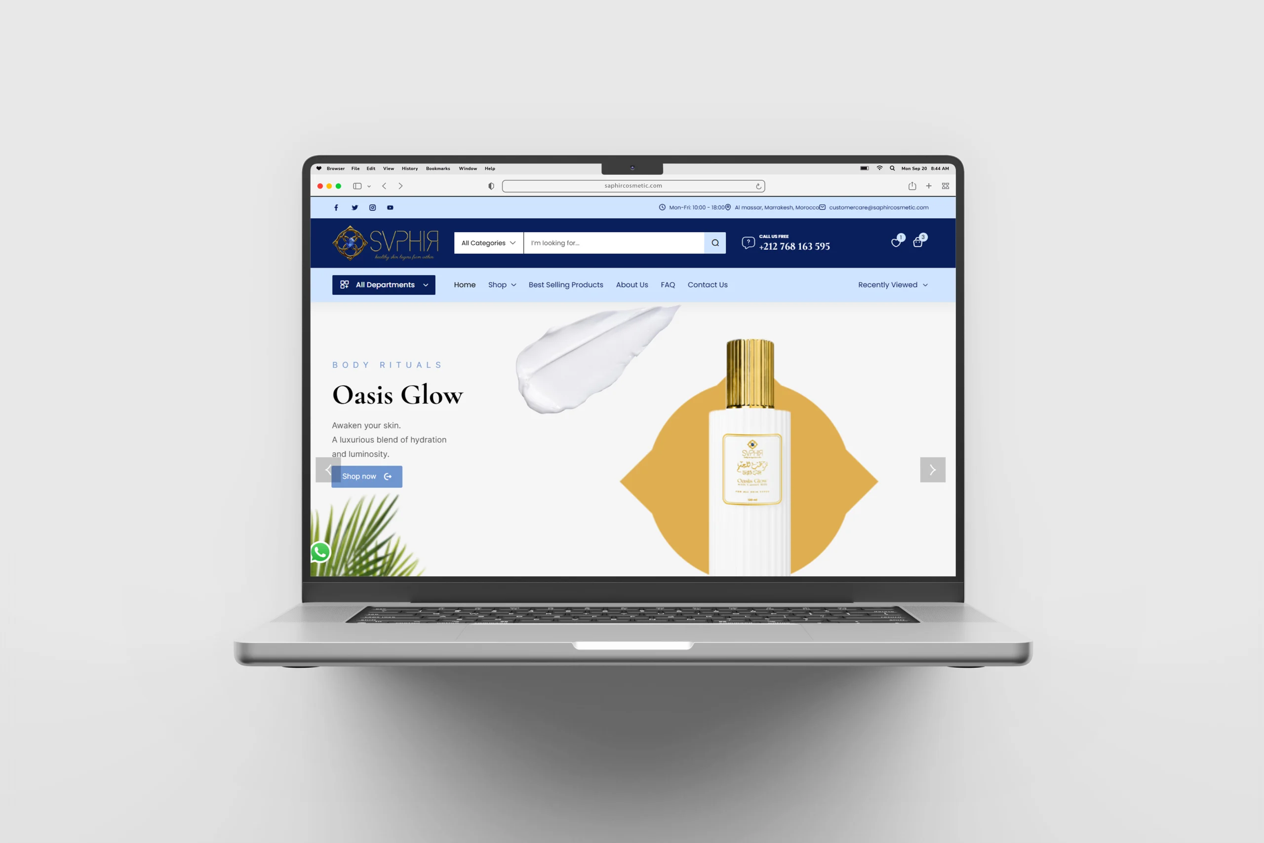
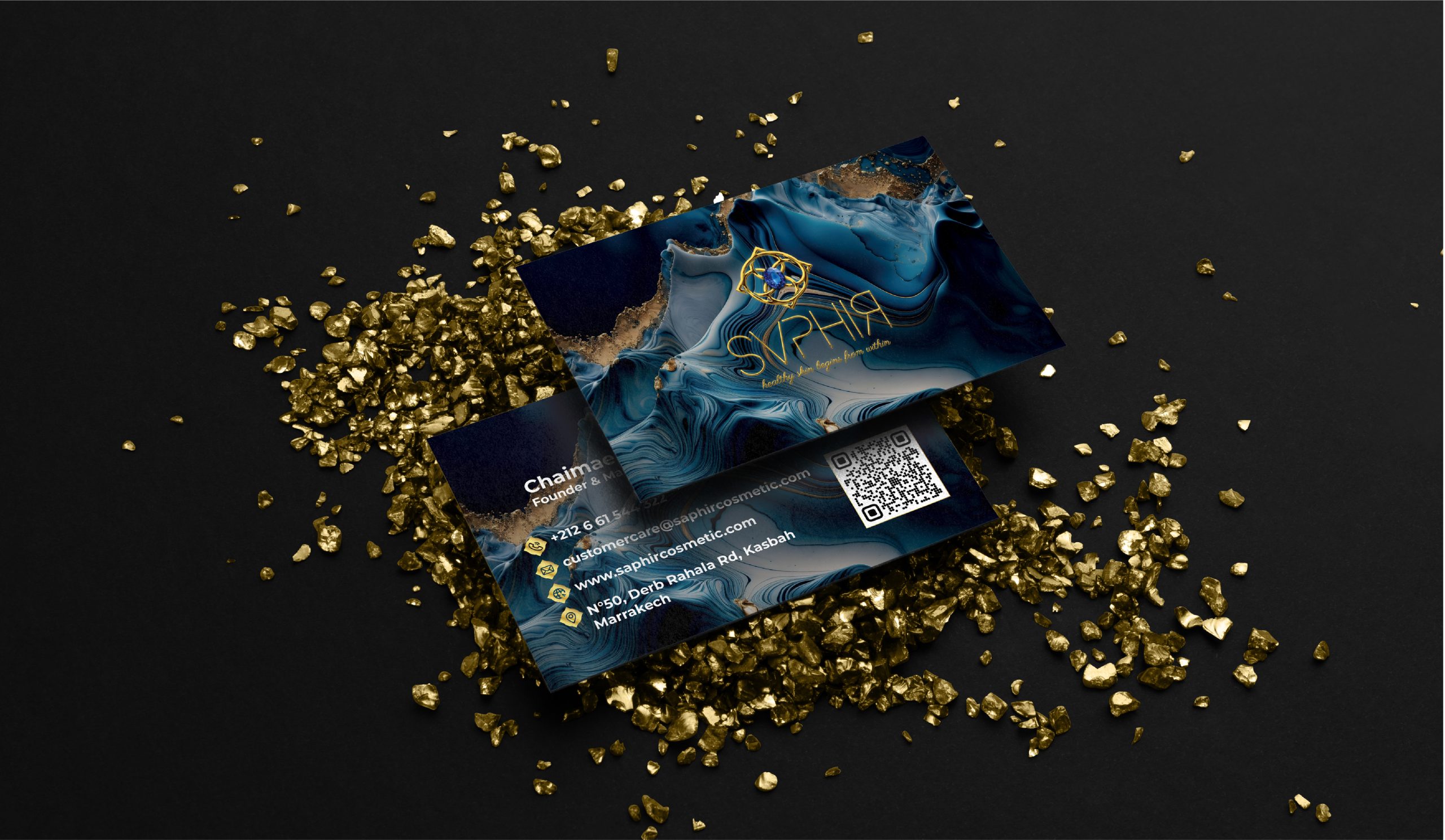
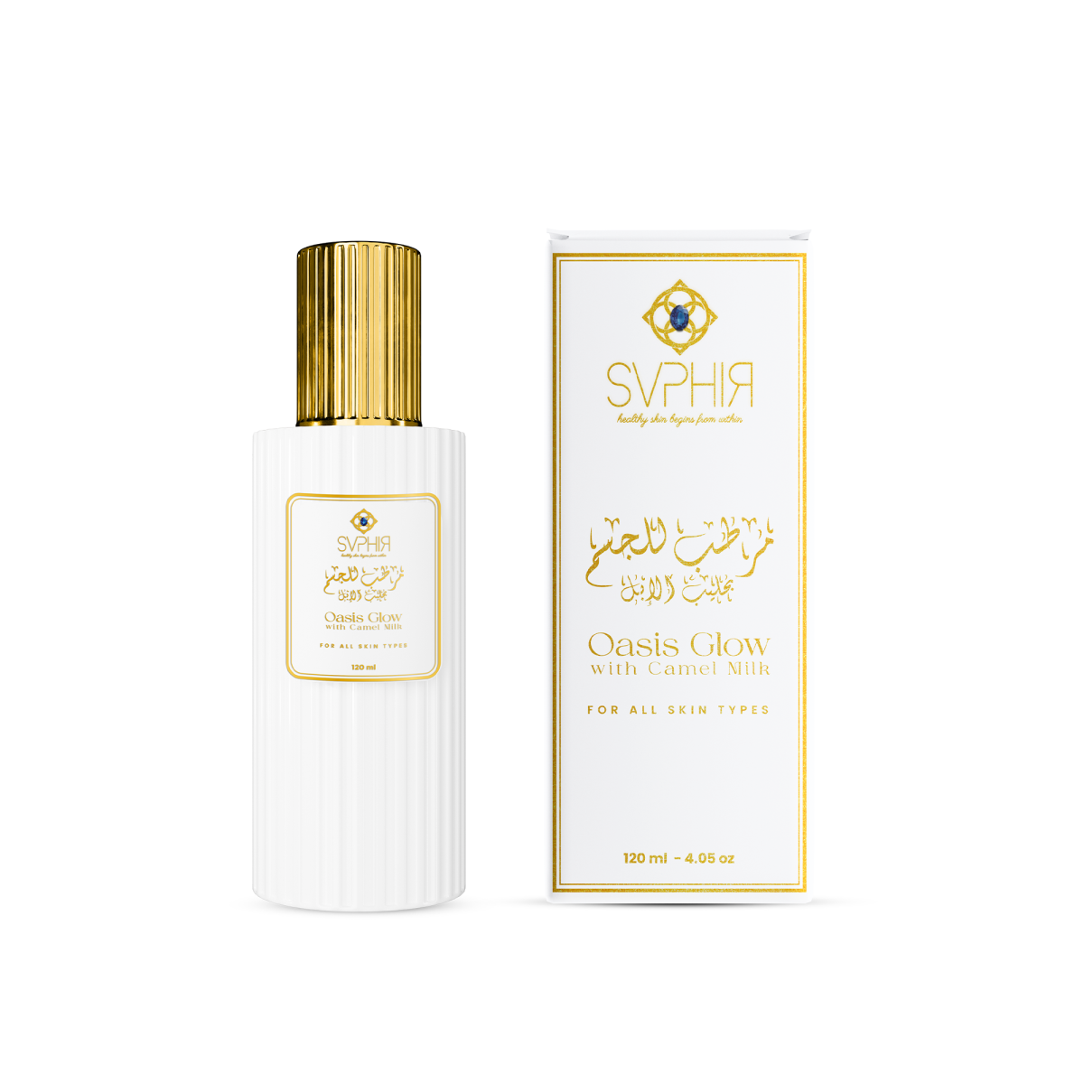
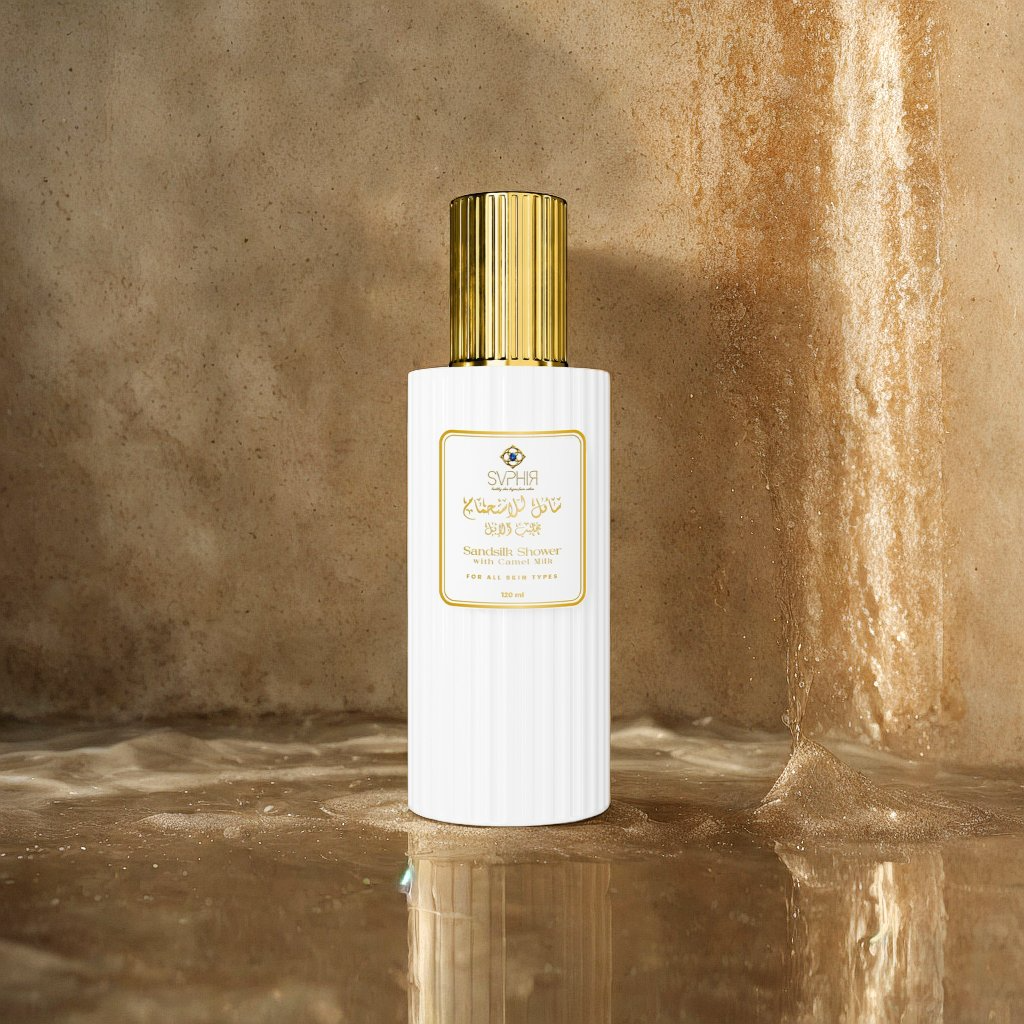
Saphir is elegance in a bottle. The brand had class, quality, and killer products—but the visual presence? Meh. We turned that “meh” into “YASS.” No flashy campaigns, just strategic, stunning, scroll-stopping work.
Preliminary Design or Layouts
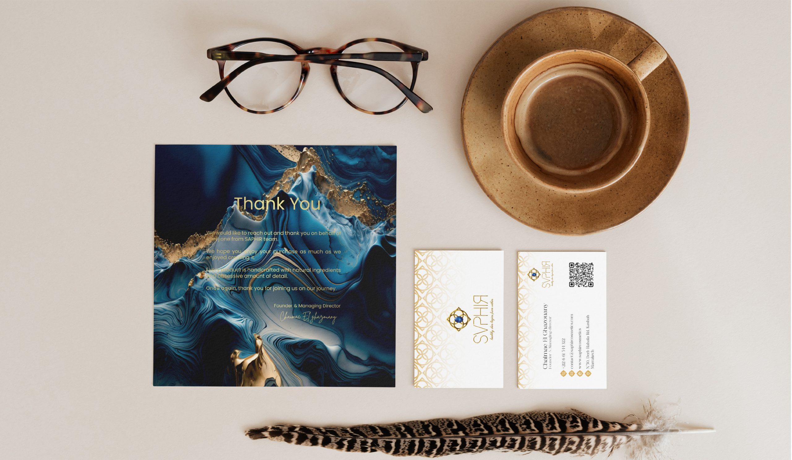
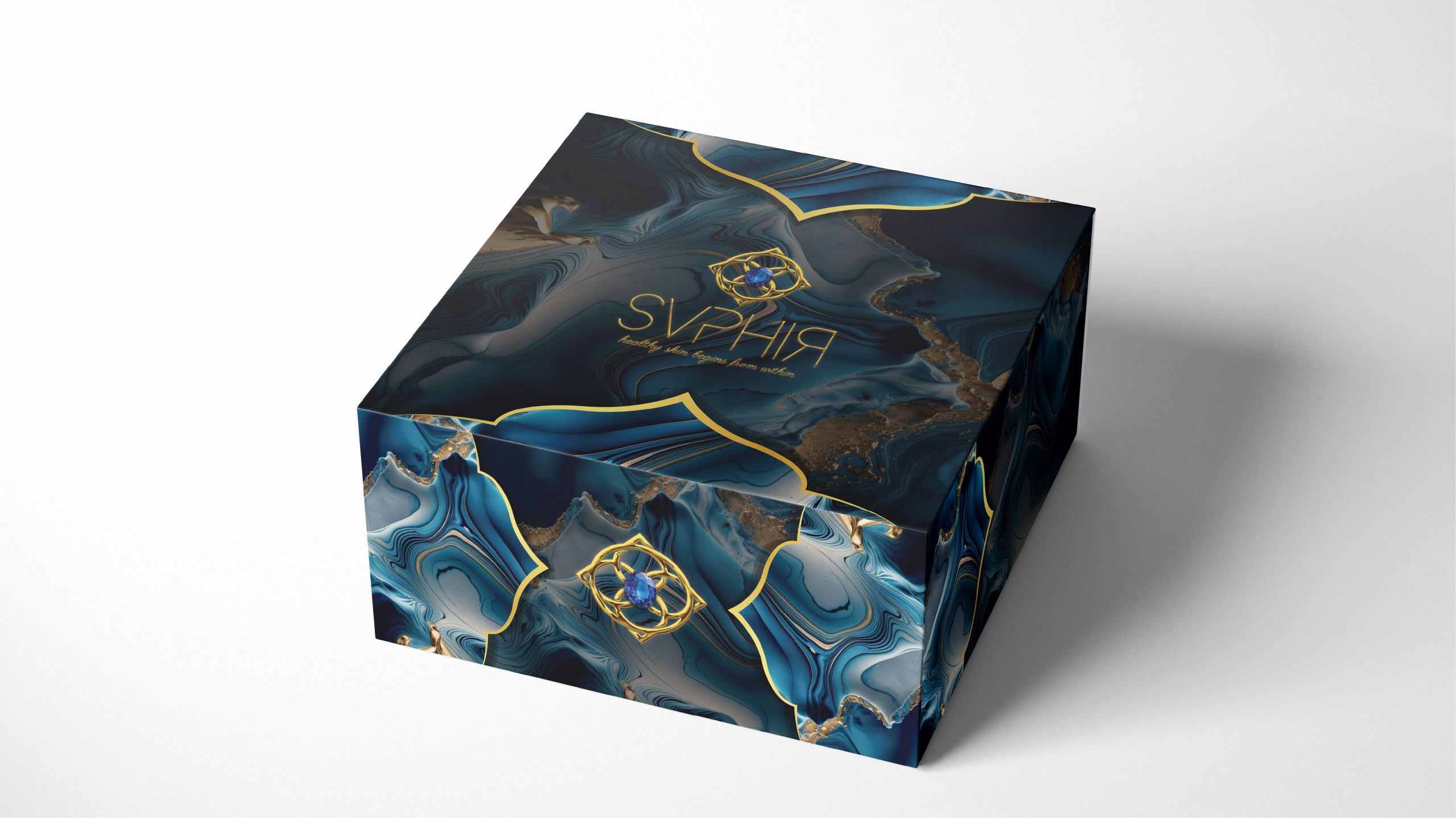
We sketched out a world where luxury feels effortless. Fonts with flair, a palette dipped in class, and packaging that whispers, “I belong on your top shelf.” We ditched the noise and went full sophistication—without ever being boring.
The Challenge
Here’s the kicker: no advertising budget. So how do you make noise without shouting? Simple—you look so good people can’t ignore you. It was all about organic magnetism and design that does the talking.
Even without ads, Saphir found its tribe—and fast. The brand now oozes premium quality, and its visuals are doing exactly what ads would’ve done (but prettier). It’s giving “quiet luxury,” and honestly? It’s kind of iconic.


